Stopping churn by proving revenue impact. Transforming ROI from a sales-led workaround into a self-serve product capability that helped customers justify $10K–$50K+ annual renewals.
Making ROI proof self-serve, scalable, and trustworthy
G2 was facing significant churn. Customers couldn't justify $10K–$50K annual investments without concrete ROI. Proving value was only possible through manual, ad-hoc analysis for a small subset of cooperative customers.
Transform ROI from a sales workaround into a core product capability. Enable customers to prove G2's impact using their own revenue data, on their own terms—without sales involvement.
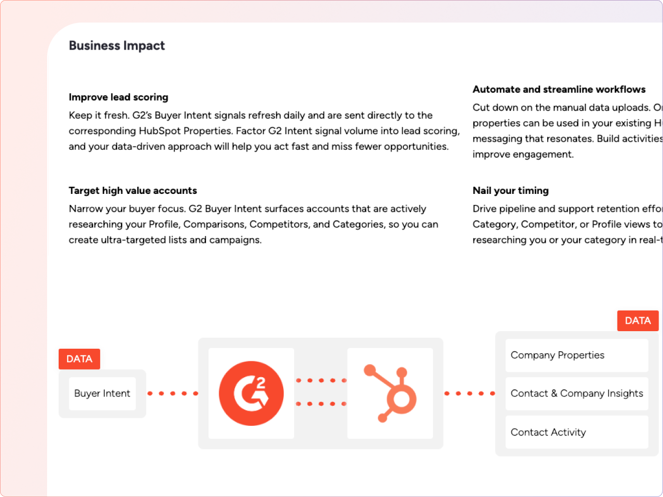
Connected customer CRM data with G2 buyer intent signals to surface G2's influence across the sales funnel. Customers could identify $50k–$4M+ in G2-influenced revenue.
I led design for this initiative, partnering with four engineers and a Product manager. My responsibilities included defining the end-to-end ROI experience from onboarding to insights, designing CRM authentication and CSV upload flows with a strong focus on trust, partnering with engineering on data permissions, and working with the business manager to align revenue definitions, attribution logic, and metrics used in renewal conversations.
The hardest problem wasn't analytics—it was trust
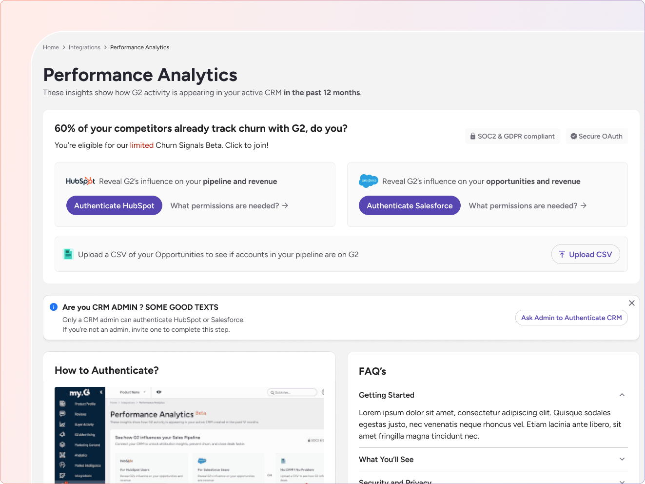
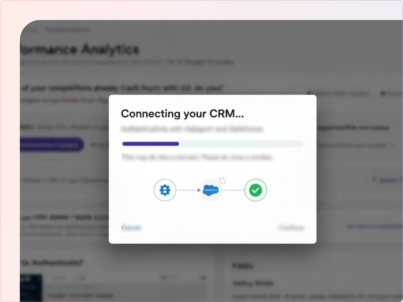
To calculate ROI, customers had to authenticate their CRM (Salesforce or HubSpot) or upload a CSV containing sensitive deals and customer data. Most users dropped off during CRM authentication.
Building trust through transparency and choice
We explicitly designed CRM connections as read-only, clearly communicating what data would be accessed, what would not be modified, and how data was used exclusively for ROI calculation. This reduced fear and increased completion.
Rather than asking users to connect their CRM immediately, we framed setup around what they would learn, previewed insights they would unlock, and positioned authentication as answering a business-critical question.
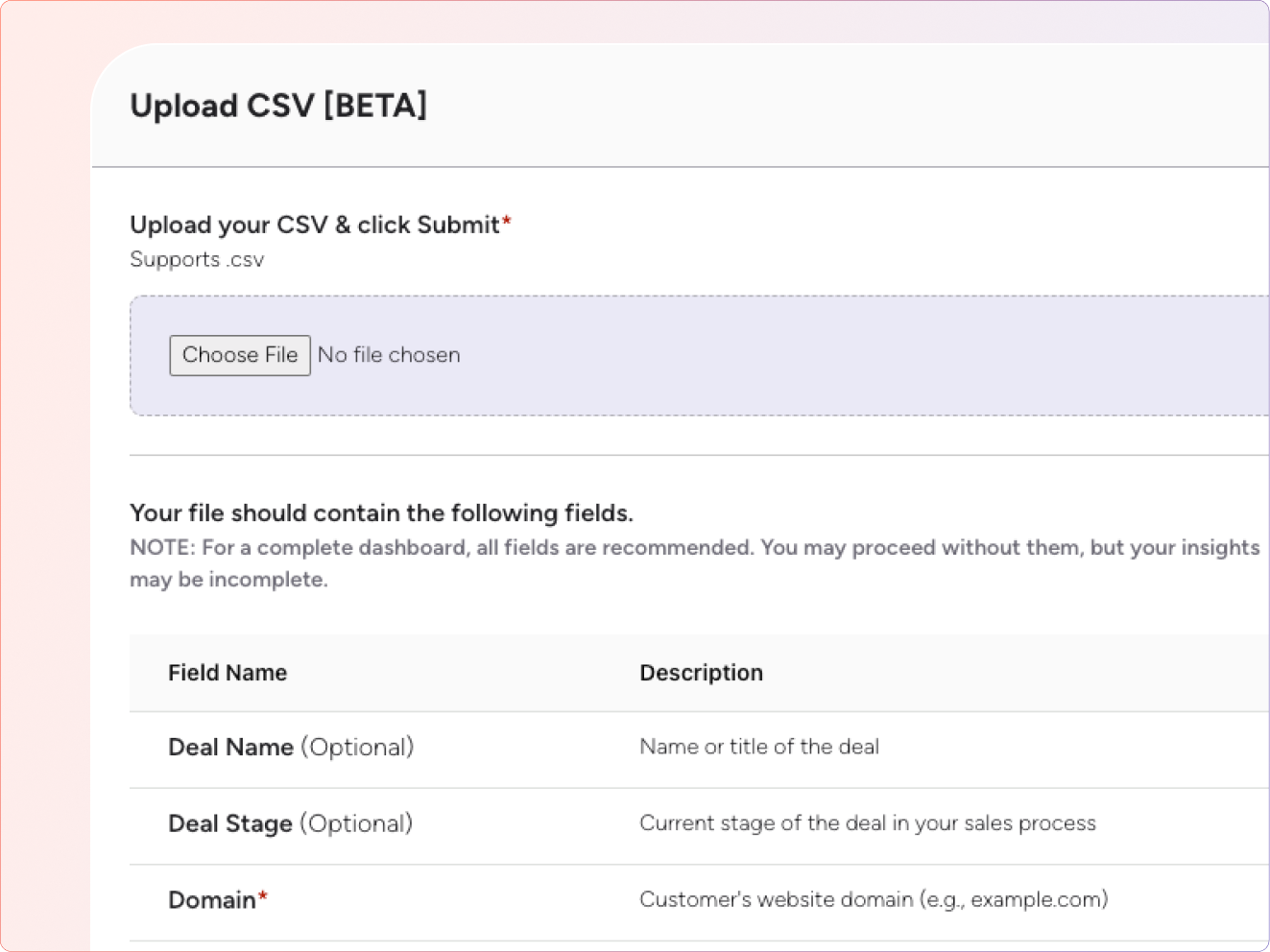
Recognizing not all customers would trust CRM authentication, we designed CSV upload as a lower-trust, lower-commitment alternative. We accepted slower setup in exchange for higher adoption.
From onboarding to actionable insights
Before asking for any data, we show users exactly what they'll get: sample ROI insights, example revenue attribution, and the specific questions the dashboard will answer.
Users choose between CRM authentication (Salesforce/HubSpot) or CSV upload. Each option clearly explains data requirements, permissions, and what G2 can and cannot access.
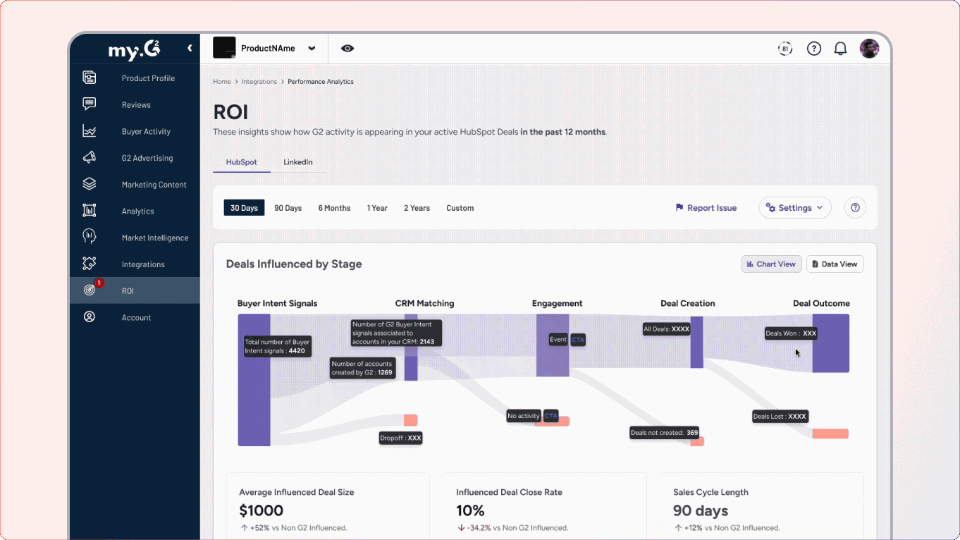
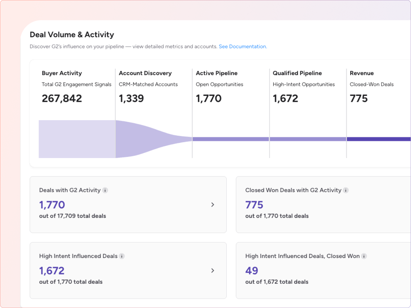
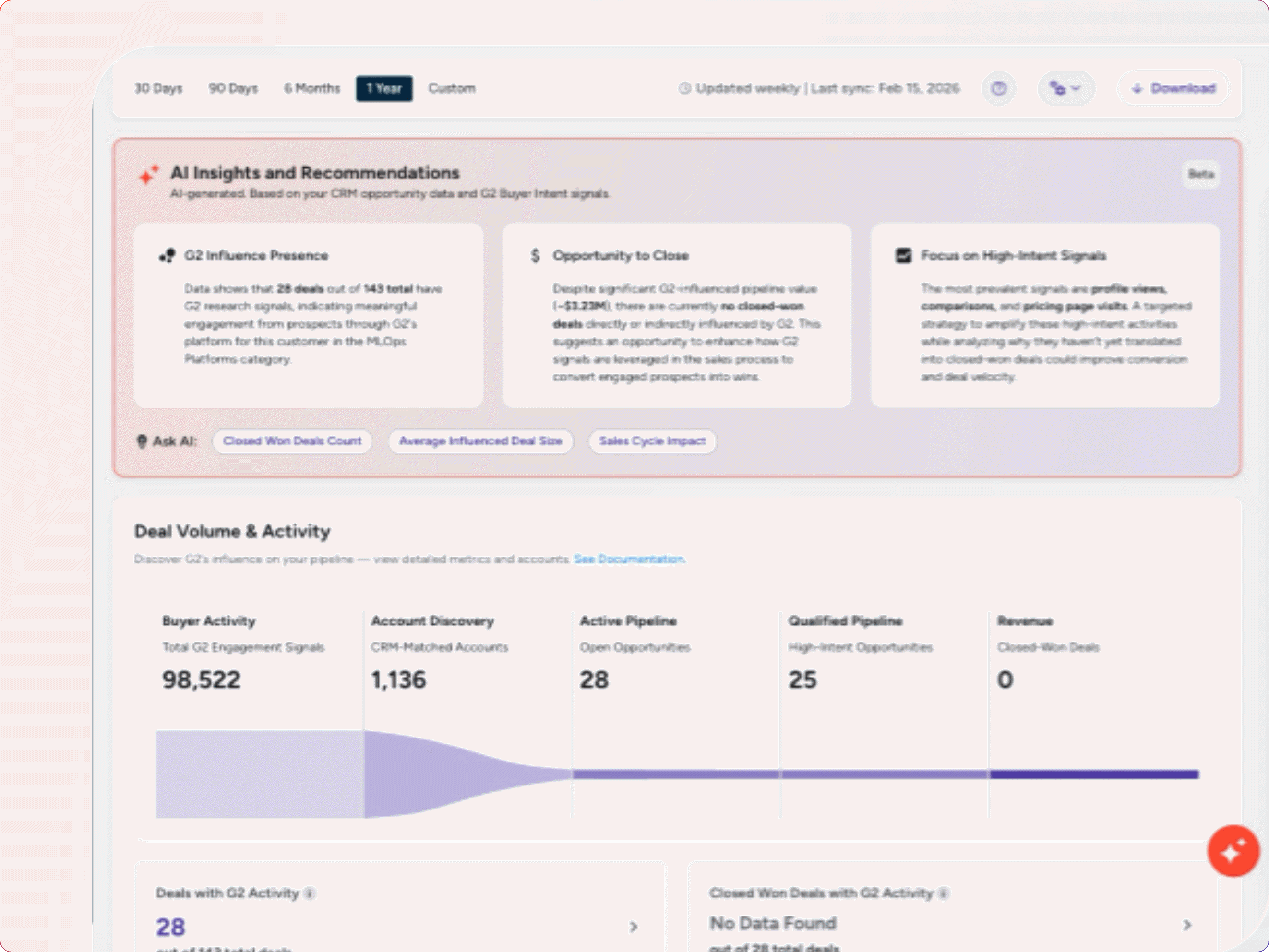
The system reads CRM deal and account data, matches accounts with G2 buyer intent activity, and identifies deals influenced by G2 research.
Customers see quantified revenue influenced by G2, in-pipeline vs closed-won impact, and can answer with confidence whether G2 is worth renewing—backed by their own data.
Turning a product gap into a clear value opportunity
Customers with Buyer Intent could see the complete picture with the all the intent signals:
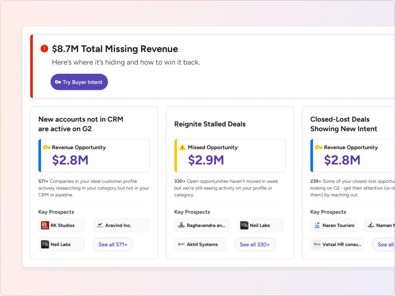
Non-Buyer Intent customers saw only partial ROI. Rather than hiding this gap, we used it to explain what they were missing:
Instead of pushing a sales message, the upsell card framed Buyer Intent as a way to unlock full ROI visibility. We showed customers exactly what they were missing:
Signals that couldn't be fully mapped without Buyer Intent
Companies actively researching on G2 but missing from their CRM
Potential revenue being missed without Buyer Intent data
Transforming ROI from sales workaround to product capability
From near zero baseline within one year
G2-influenced revenue per customer
During critical business period
Enabled customers to confidently justify $10K–$50K+ annual renewals using data-backed insights rather than anecdotal evidence
Scaled ROI proof beyond manual sales analysis, allowing more customers to see G2's impact without direct sales involvement
Established a foundation for reaching the long-term 80% ROI adoption goal
Transformed ROI from a sales-led workaround into a self-serve product capability
Further optimize the authentication flow to improve completion rates
Request only essential permissions initially, expand as trust builds
Show estimated ROI before authentication to increase motivation
What I learned from this project
When asking users for sensitive data, the UX isn't just about usability—it's about building confidence. Every interaction must reinforce that their data is safe and used only for their benefit.
Users are far more willing to share data when they clearly understand what they'll get in return. Previewing outcomes before requesting access dramatically improved conversion.
Not everyone will trust the primary path. Providing alternatives (like CSV upload) captures users who would otherwise abandon entirely. Lower commitment beats zero adoption.
Discover how a self-serve ROI dashboard stopped churn and transformed customer renewals